I'll do this post to point out changes that I would like to see.
THIS IS BY NO MEANS A TOPIC TO TRASHTALK THE GAME OR WHOEVER WORKED ON IT.
I know the current state of the game is not final and changes will happen in coming days/weeks.
Some HUD "requires" some rework in my extremely humble opinion. Here is AOE1:DE UI. It looks clean. Even at 150%
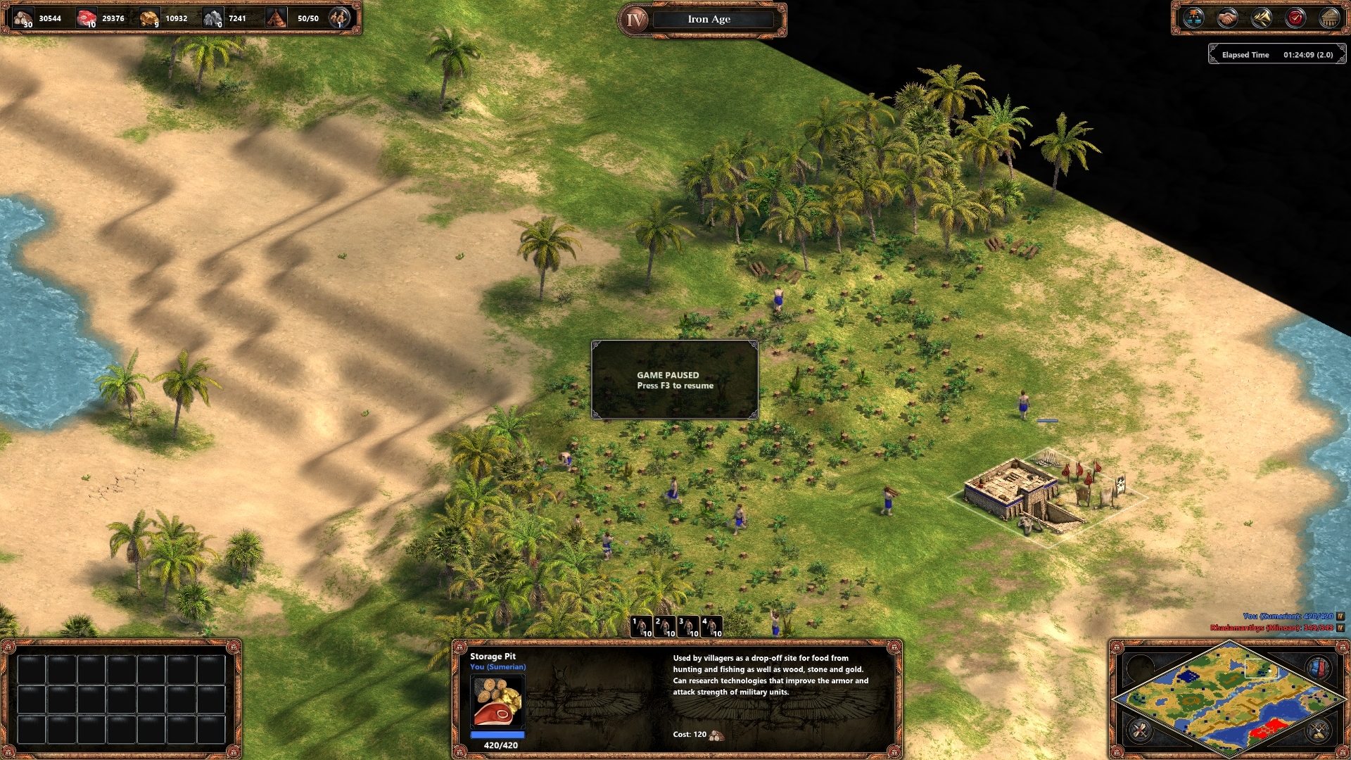
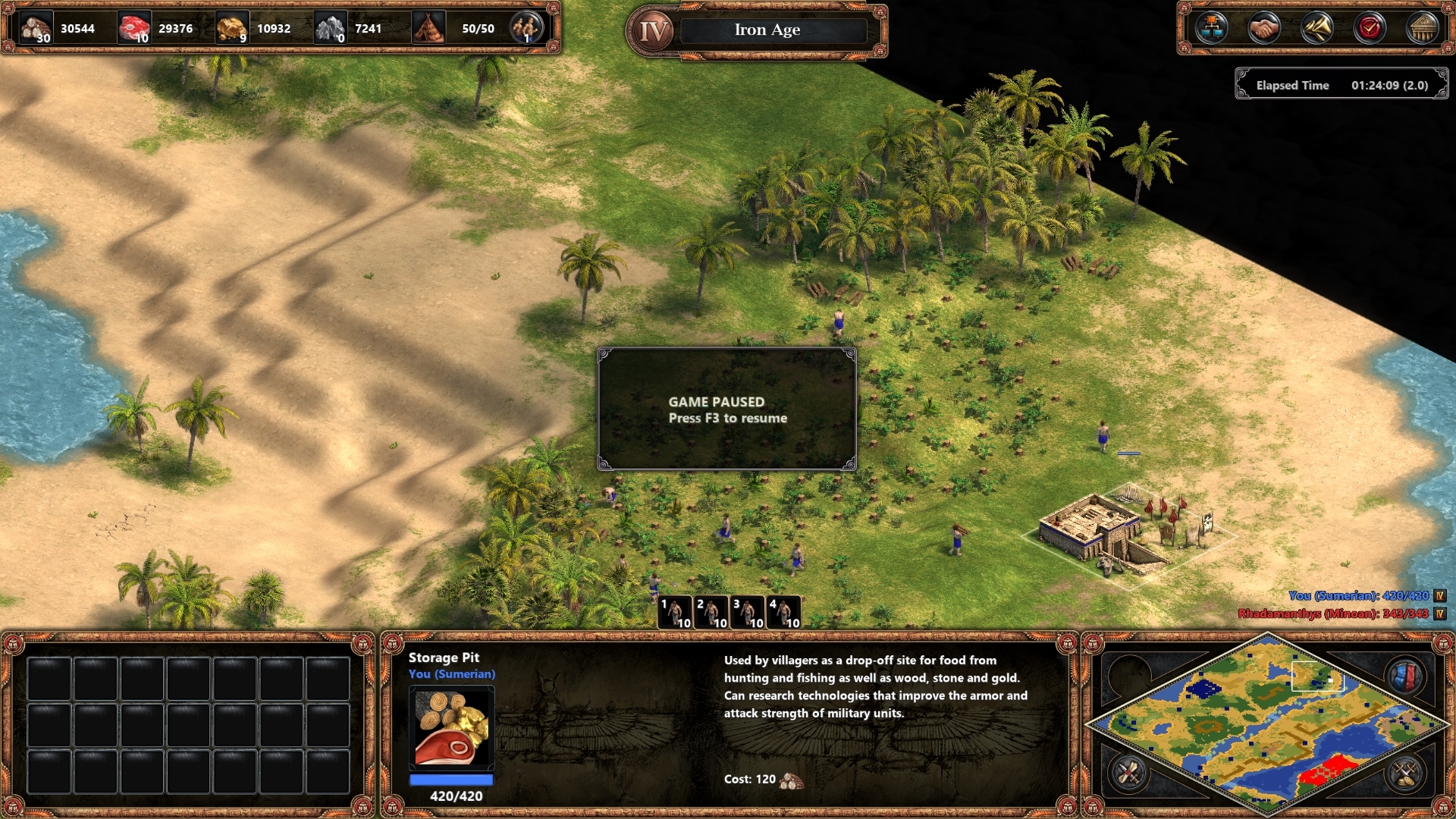
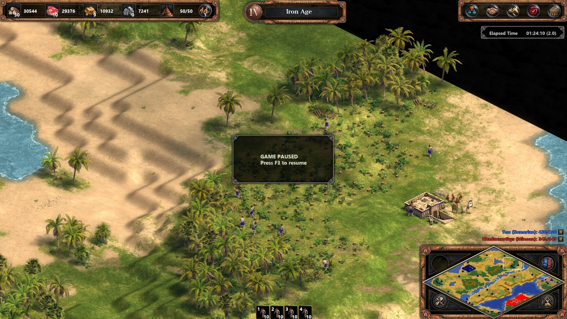
But now, check AOE2:DE
Let me enunciate:
- Why is the timer looking like it's a last second addition?
- Why group numbers management is so clunky, mecanically and visually speaking?
- What's this big hole between the minimap and the main panel? If there's a button to collapse it, why is there not a button to extend it all the way to the minimap?
Let's hide it when nothing is selected, good and old idea!
- Why is the minimap coming out of its window unlike AOE1:DE? Why is there a background for the score display, and why it appears so big?
My HUD scale currently in AOE2:DE is 110%. Sure, you say, I could tone it down. But then the other informations are a little bit to small to me.
The top information bar (ressources, menu) in AOE2:DE also is looking odd. Maybe drag out the menu buttons horizontally and make its size the same all the way.
Also, but not shown here, is the queue (units and techs) in the top left. There's a lot of space in the main display window that can be used.
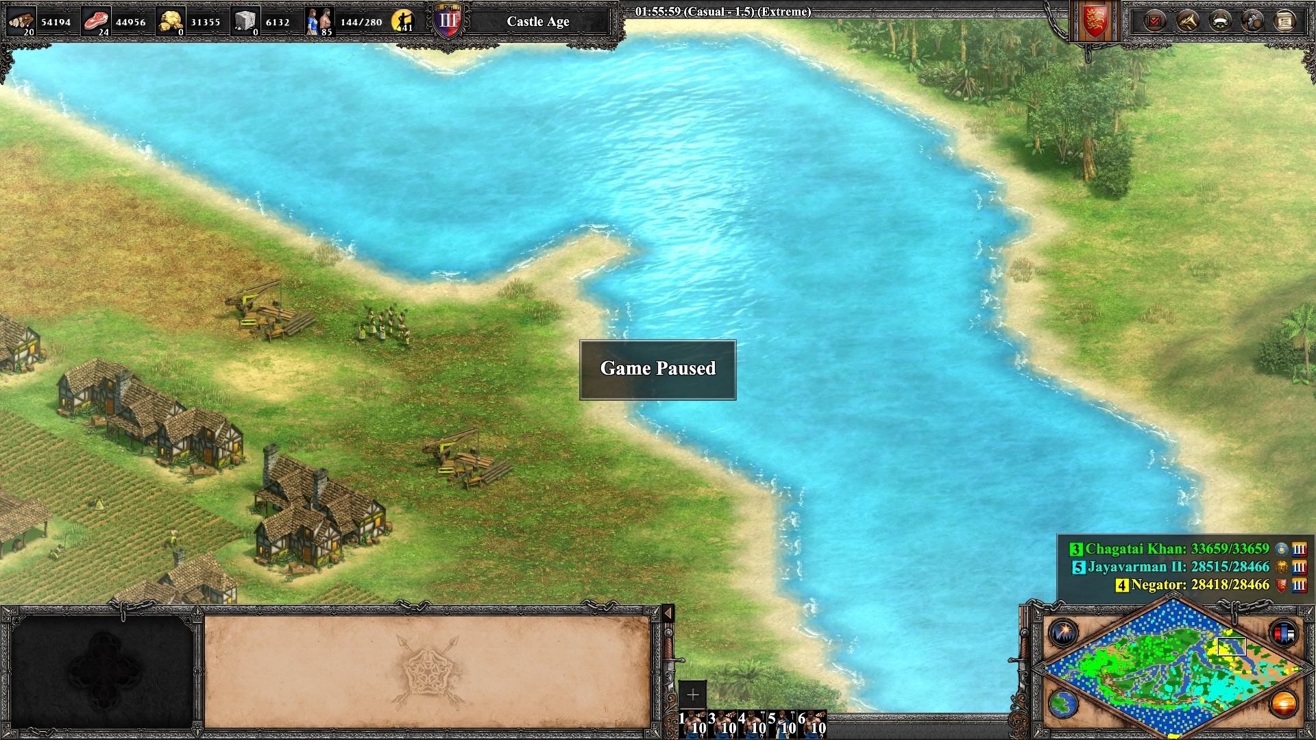
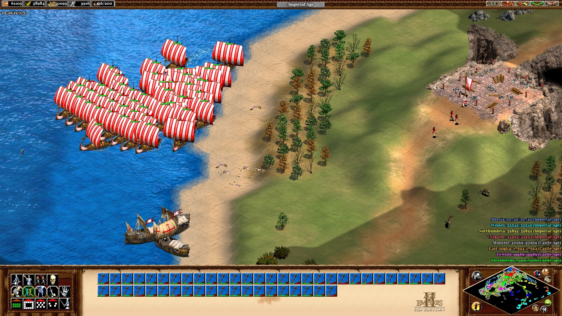
For reference, I'm adding a AOE2:HD HUD picture.
I'm not asking to change all of that together, but it would be nice to have a few additionnal options that we could change. Making part of HUD smaller, without touching others. Don't get me wrong, game is super good looking, and I'll spend hundred of hours on it. But, ye, some QOL changes could be welcome.
Quick paint work
TL;DR
Few things that pleased me in both AOE1:DE and AOE2:HD but changed and are, in a way, worse than before: score background, minimap not longer anchored, weird looking menu bar (bring back horizontal buttons!) and resources display, group managers.
[link] [comments]
from newest submissions : aoe2 https://ift.tt/2pi9TQg
No comments :
Post a Comment